
Using Bootstrap Breakpoints for a Responsive Web Design
When designing a website for the use across multiple device sizes, breakpoints in bootstrap ensure your product looks custom for any viewing experience.

With a greater number of individuals prioritizing the use of a mobile device over a traditional PC online resources, specifically, webpages, need to be constructed in a way that is not just usable across devices, but thoughtfully responsive to both environments.
Designers and developers need to consider a myriad of different situations to make sure that the application works as intended, but first and foremost, the site needs to look as thoughtfully designed on a mobile device as it does on a computer screen.
Having two different sites may be where some people’s minds go first, but for the purposes of consistency, a single site that is responsive to both screen sizes is the ideal situation but can muddy how to ensure everything works.
Enter, Bootstrap Breakpoints…

First, what is Bootstrap?
Bootstrap is an open-source, front-end framework that helps a developer structure the visual elements of their HTML code. More simply, it is a “CSS-assistor,” in that the structural and styling elements able to be utilized in Bootstrap are abstracted for the programmer so that the programmer can call references, often in the form of class on HTML items, for the styling to be applied.
There are a plethora of applications for the Bootstrap framework, but one of the most common instances of use is for creating responsive websites. This feature allows developers to create a single version of a website where the structure of the website is modified based on the screen size of the device being used to view the website.
The core feature that helps this happen is the employment of breakpoints.
Second, what are Breakpoints?
It is possible with traditional CSS structure to implement a consistently changing structure that allows for adjustment based on screen size. Depending on how this is set up, it can result in un-viewable information. This is because the adjustment of small text, images, or clickable elements may be set to be relative to the overall screen size. This becomes a problem when small items on a PC screen are scaled (relative to the rest of the page) down to the size of a mobile device, in turn making them too small to read or function effectively.
While the use of Bootstrap does not completely mitigate this issue, the use of Breakpoints helps ensure that there are set parameters that help ensure the integrity and readability of the page.
Breakpoints are defined as elements that control how the layout is adapted for a particular viewport or screen size (source).
What this means is that there are default screen pixel sizes that are used to help the website respond to how it should be formatted. The default screen dimensions listed below are assigned to specific Breakpoint “sizes".”

The default sizes can then be used, in combination with other Boostrap elements, such as columns and rows, to determine how the format would be displayed depending on the size of the screen.
How to use Breakpoints in HTML?
Breakpoints are data points that are used in conjunction with other elements. The width of the screen is set to always have 12 possible individual columns, with elements spanning one or more of those columns.
Before the use of Breakpoints, you will need to setup up Bootstrap in your HTML file. This process is beyond the scope of this blog, but can be found on the Bootstrap documentation website found HERE!
In addition, you will need to have some HTML elements added to your file, on which Breakpoints can be applied. Much of Bootstrap functions on creating responsiveness in a grid system consisting of containers, columns, and rows.
Here are links to the pages for setting up the grid, containers, and columns.
Using the default Breakpoints as the indicator of screen size, you can indicate how many columns an element (container, column, etc) will occupy on a specific screen size. These calls are made as classes in the object (or parent object) on which the formatting will be made.
For example, an HTML element with the class “col-md-6” will have the element on which this class is called, occupy a width of six columns (50% or the screen) when the screen size is medium or larger.
<div class="col-md-6">
This issue with this is that there is no specific information regarding what should happen when the screen is smaller than “medium.”
For this, you can add additional Breakpoint elements to the class. In this example, the logical addition would be to make sure to account for all possible screen sizes. In order to do that, you need to account for the extra small screen. Adding the following line of code creates two ranges for which the HTML item would be formatted.
<div class="col-xs-12 col-md-6">Now, if the screen is either within the “extra small” or “small” Breakpoints, the item would take up the full width of the screen, whereas, on screens medium and larger, the item would take up half the screen. One could add a call for each Breakpoint if a change was to be made for every screen size.
<div class="col-xs-12 col-sm-9 col-md-6 col-lg-3 col-xl-1">This is roughly translated as… when the screen size is XS, this object will take 12 columns of width, when the screen size is sm (small), this object will take 9 columns of width… etc.
Example of Breakpoint Application for Responsive Design
The example below is a code snippet for a container that will ultimately be populated by a list of items returned from a search algorithm.
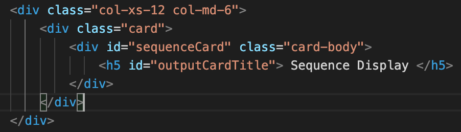
You can see that for this division, The card will either take up the half of the width of the screen (as seen in Image #3) for smaller screens or half of the screen (as seen in in Image #4) for larger screens.


Summary
Bootstrap and Breakpoints allow for a very efficient and effective means of adding responsive elements to your website. As mentioned above, with the global trend toward broader use of mobile devices, such as phones and tablets, developers need to ensure that the products they create look good on any screen.